
Comboboxes
Public Article
 Certified Article
The content of this article is certified for accuracy by the Digital Accessibility Centre.
What Are Comboboxes?
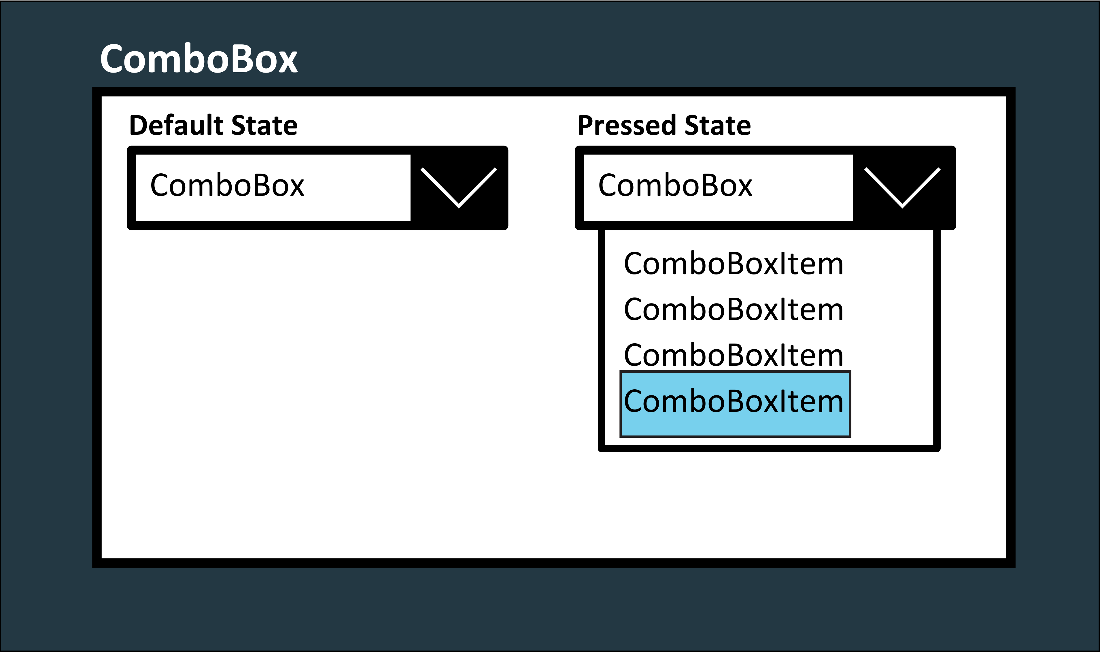
Comboboxes are user interface elements that provide a selectable list of options and an editable input field. They are also known as "combo boxes" or "dropdown lists." Developers widely use Comboboxes in software applications, websites, and forms to allow users to select a single item from a predefined list or enter custom text if the desired option is unavailable.
Advice for Accessible Comboboxes
Here are three accessibility considerations that you should make when taking Comboboxes into account:
- Keyboard Accessibility: Comboboxes should be operable using the keyboard alone. The list of options should allow users to navigate using arrow keys and visually highlight the currently focused item to indicate its selection state.
- Screen Reader Compatibility: Comboboxes must be compatible with screen readers. When a screen reader user interacts with the Combobox, it should announce the available options, the currently selected option, and any relevant changes made to the input field.
- ARIA (Accessible Rich Internet Applications) Support: ARIA attributes, such as aria-expanded, aria-owns, aria-controls, and aria-activedescendant, can be used to enhance the accessibility of Comboboxes, making their behaviour and relationships with other elements more understandable to assistive technologies.
Autocomplete via Combobox
The autocomplete function can significantly impact the accessibility of Comboboxes. When appropriately implemented, it can enhance the user experience for everyone, including individuals with impairments. However, it introduces specific considerations to ensure the feature is usable and accessible. The following are three positive impacts that having autocomplete system inside of Comboboxes would introduce:
- Efficiency: Autocomplete can speed up finding and selecting options, making interactions more efficient for all users.
- Reduced Typing: Users with motor impairments or limited dexterity can benefit by selecting options from a list instead of typing out entire entries.
- Error Prevention: Autocomplete can help prevent spelling errors or selecting non-existent options, which can be particularly helpful for users with cognitive or visual impairments.
Button Activiated Comboxes
Button-activated Comboboxes, also known as dropdown button Comboboxes or split-button Comboboxes, have a button or a clickable element that, when activated, opens the dropdown containing a list of options. This design can impact the accessibility of Comboboxes, both positively and negatively. Here's how button-activated Cmboboxes affect combobox accessibility:
Positive Impacts:
- Clear Interaction: The button provides a clear and distinct element for users to activate the dropdown, making the interaction more straightforward and intuitive.
- Reduced Clutter: By separating the activation control (button) from the input field, the interface can be less cluttered, benefiting users who might find a cluttered interface overwhelming.
- Enhanced Target Area: The button serves as a larger target area for activating the dropdown, which can be particularly beneficial for users with motor impairments or touch devices.
Tools Required, How to Test and Other Important Information
Tools Required to Test Comboboxes
-
Keyboard
-
Screen Reader
-
Web Development Extension
-
Accessibility Evaluation Tool
How to Test Comboboxes
-
Open the Webpage to be tested
-
Check if the Combobox has an associated label that describes its purpose. Ensure there are clear instructions for opening the dropdown, selecting an option, and closing the dropdown.
-
Verify that the Combobox receives focus when tabbed into and that there is a clear visual indicator around the focused element. Ensure the focus isn't confined to within the Combobox, allowing users to navigate easily between other elements.
-
Test the Combobox using only the keyboard. Ensure users can navigate through the options using arrow keys, select an option using the Enter key, and close the dropdown using Esc or Enter (if applicable).
-
Use the screen reader to interact with the Combobox. Listen for announcements about the Combobox, its label, available options, and the selected option.
-
Use the Accessibility Evaluation Tool to scan the web page and identify any potential access issues with the Combobox and the page in general
Potential Accessibility Issues of Comboboxes
The Comboboxes could potentially:
-
have the focus trapped within it or have no focus at all
-
not be fully keyboard accessible
-
not be accessible to screen reader users
WCAG 2.1/2 Guidelines for Comboboxes
Further Reading
Comboboxes was posted on 14/08/2023 @ 18:11